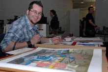
Will as you already know, I haven't been posting here much since starting our Kickstarter fund raising adventure! However I am proud to say, we were successful in raising $6,551, that's $551 over the $6K goal! WOOT! I cannot thank those who pledged enough, we have the entire series completely written and drawn and would not have been able to get this project to the next level without their generosity!
So, now what? lol
Well we are putting the final touches on our contracts for the colorist and letterer, which should put us on a 30 day schedule for each issue, as long as everything goes well. I will continue to post update on Kickstarter for those who backed us with exclusive content. Mostly pages completely colored and/or lettered as well. In addition, Steve and I will be submitting to publishers, hoping to find the best place for our project.
However, I must post content here as well. So I will only post artwork here and there that have already been posted during the original Kickstarter 90 day drive.
Here's a tease, first issue's cover. Though we don't have a home yet, this logo just looks and feels right on here!
Click image to enlarge.

In other news. In case you don't follow me on twitter or facebook (links are listed to the right), I planned on modifying my art desk once this book was over. This was brought on because I've had major back issues from my day job (too much heavy lifting) in addition to hunching over an art desk nightly (a year's worth of chriporactor visits). So I was tired of using a light box similar to this one:

I've been using this to ink pages for 6 years, enough was enough. So I decided to build my own and cut a hole in my desk to fit a sheet of glassto create my own custom light box. This will, hopefully, stop any further damage to my poor back!
Here's a few before images:


And here's the after, still need a piece of glass. Since it's a holiday weekend every place I called yesterday was closed.


It's quite simple if you have the time, patience and tools. I think total cost to me (having to purchase a few tools) was $300. Total time to construct, 4 hrs.
Box is measure at 16"x20"x5"x.75", opening is 15"x19"x.25" (routed out). I also remove 3" from the front of the desk so I could reach the lightbox area better. All you need are the following:
Pressboard
Corner Brackets
.5" screws
Light fixture with bulbs and cord
Drill with bits
Router with bit
Jigsaw
Screw driver
I'm super excited to use this.
Thanks for stopping by and look for future updates soon!


3 comments:
Is Image really the best place for it though?
With it being your job to pay for the printing, and your job to pay Image their "franchise fee," both regardless of sales, I begin to wonder where the advantage is over self publishing. Sure the Image "i" has some brand recognition, but that only gets you so far. Just look at the Image section of previews. You'll find quite a number of books you didn't even know existed because the Image brand wasn't enough to get them any significant sales.
I dunno. I'm sure there's plenty of people who do very well at Image. I just thing for a company that likes to portray themselves as the ultimate creator-friendly company they sure do put a lot of (ie. ALL) risk on the creator.
I don't know who else you're pitching to but I almost hope for your sake that one of them choose to take it instead.
Either way the pages you've posted look fantastic. Obviously haven't read it but just based on the visuals I think it's got a great chance no matter where it ends up.
Hey Ziggy,
I appreciate the concern. Not having ever pitching to them I have no idea what their deal may be. I have heard a mix of good and bad things. So we'll see, obviously Steve and I will ultimately go with the best company and deal possible.
R!
Rob,
Congratulations on hitting your mark! I can't wait to read the story.
I have the goal of publishing an original story some time in the future as well so you have been a big inspiration for me.
I wanted to see if I could trouble you for a critique on a cover I recently created. To hone my storytelling skills I'm working on a Thing vs. Hulk story arch during my free time and have been posting the pages on my Deviant Art account [since I can't try and make any money off of the project]. The goal with my covers is to create a montage from the various story elements in each issue, similar to what you've done on your issue #1 cover.
If you have the time to take a look and offer any feedback on my cover it'd be much appreciated. The image can be seen here:
http://grayscalexlii.deviantart.com/gallery/#/d3hkbnd
If you wanted to look at all the pages posted and offer any advice that'd be great too, though I'm purposefully not seeking guidance on the inside pages as I already know I've got a ways to go. If you don't have the time, or critiques aren't your thing that's completely cool too.
Either way, congrats again and good luck!
Post a Comment